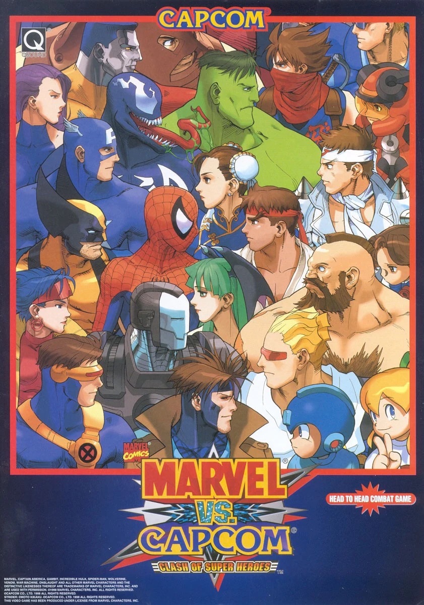
When a game validates its predecessors, it not only exalts the status of its own game but also helps revive previous interests in the old. The greatest sense of this is the first Marvel Vs Capcom. You see, this game uses elements of the Street Fighter: Turbo games and Street Fighter Vs the X-Men. With Capcom’s licensing, this game was made with one thing in mind, how much could they fit into one arcade cabinet? This is an analysis of the build of Marvel Vs Capcom: Clash of SuperHeroes and the greatest crossover of all time. But first, the combat varies from any other Fighting game, and let me tell you, it is one of the best.
The combat is a combination of what was established in Capcom Vs X-Men, with the button layout of the Street Fighter series. The six-button layout allows more variety and adds to the depth of the move set and the optimal parts of combos. Seeing the speed of this game under the framework of a street fighter layout. This in my opinion is a great foundation on which a lot of 3-D fighting games would establish later on. In appurtenance, all of the characters and their move sets fit with their comic book counterparts. That lord knows was needed, because of Marvel fans (especially). Another cool thing is how certain characters from other Capcom franchises have returning move sets and play styles, for instance, Morgan (Darkstalkers) and Gambit (Capcom Vs X-Men) being the most apparent. Supercombo Forums user R.Shiki Believes that in comparison to the second game, it is much more unbalanced and he stands in affirmation of its difficulty.
“The game has everything that casual fighting game players hate about MvC2,” Shiki said. “God-tier characters able to beat you in single throw/touch–then guard break and beat your incoming characters; characters able to lock you down and chip you to death forever.”
The sprites are mainly from whichever game was most recent to MVC 1, for instance, the street fighter characters’ sprites were from Street Fighter: Turbo, and the X-Men characters were from their crossover game as well. I love how each sprite summarizes their personality from their media. Redditor and user of the r/Fighting games page, D.Estaban believes that it is one of the most innovative fighting games Capcom has produced.
“Visually I think it’s the most beautiful in the series,” Estaban said. “With gorgeous 2D sprites and more frames of animation than MVC2, which suffers from a weird mixture of polygonal graphics and reused sprites.”
Overall, this game is a great combination of crossovers and the greatness of 90’s fighting games. This also establishes the continuation of Capcom’s masterful design.


![[Review] Bloodywood - Nu Delhi](https://fohssignal.net/wp-content/uploads/2025/05/Nu_Delhi.jpg)
![[Review] Tool - 10,000 Days](https://fohssignal.net/wp-content/uploads/2025/05/10000Days.jpg)
![[Review] Baroness- Gold and Grey](https://fohssignal.net/wp-content/uploads/2025/05/a0534473864_16.jpg)

![[Review] The Life List](https://fohssignal.net/wp-content/uploads/2025/04/download-22.jpeg)


![[Review] Architects- For Those That Wish To Exist (Live at Albert Hall)](https://fohssignal.net/wp-content/uploads/2025/05/ArchitectsFTTWTE.jpg)
![[Retrospective] Darksiders 2](https://fohssignal.net/wp-content/uploads/2025/04/images-3.jpeg)
![[Retrospective] Street Fighter 3](https://fohssignal.net/wp-content/uploads/2025/04/images-2.jpeg)
![[Retrospective]-Mortal Kombat 2](https://fohssignal.net/wp-content/uploads/2025/04/IMG_7861.png)
![[Review] A complete unknown](https://fohssignal.net/wp-content/uploads/2025/03/download-21.jpeg)
![[Restrospective] Bloodbourne: The Old Hunters DLC](https://fohssignal.net/wp-content/uploads/2025/03/IMG_7839.jpg)
